
This week's pick is...
 VS.
VS. 
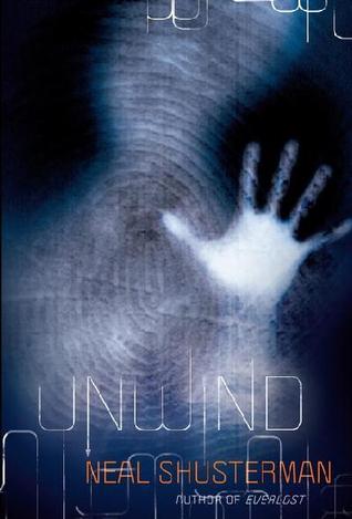
Original Redesign
The new cover is SO BORING! It's Across the Universe all over again (though, at least this time they waited until the series was over with)! It's just a white background with text, at least the other cover is interesting AND relates to the book!
Final Verdict: Original
Final Verdict: Original
Do you agree? Give me your thoughts on which cover is the best!
I am so with you on this one. The redesign looks like a placeholder for before a real cover is released! I get nothing from looking at it.
ReplyDeleteI like the original cover because, like you said, it actually relates to the book. It's kind of creepy too which I like.
If I hadn't heard so much about this book, I would be hesitant to pick it up based on either cover. Overall I still think they could have done better.
ReplyDeleteI agree with you. I love the original.
ReplyDeleteI agree with you. I love the original.
ReplyDeleteDefinitely agree with you here, the original stands out and says more about the story than some white words on a age ever could!
ReplyDeleteEnchanted by YA: http://enchantedbyya.blogspot.co.uk/2015/11/ya-shot-wrap-up-haul.html