
This week's pick is...
 VS.
VS. 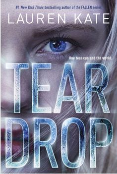
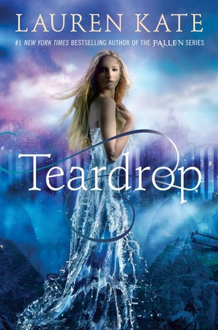
Original Redesign
While I do think the proportions are weird on the original cover, I do think it's a very pretty cover.I love the cool colors and how the dress turns into water. The redesign is not a bad cover, it's actually pretty cool, but I'm not the biggest fan of covers that feature just a face and while I love the text, it looks really awkward on top of the face.
Final Verdict: Original
Do you agree? Give me your thoughts on which cover is the best!
I'm pretty sure most people prefer the original! I love the new one. The original does have pretty colors, but it has an awkwardness to it that I don't like.
ReplyDeleteI agree that the text is great on the redesign, but I prefer the original as well.
ReplyDelete